My Year of Monet #3: Monet & Me – Reinventing Ourselves
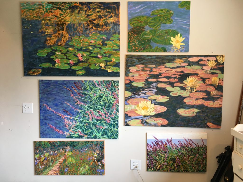
Featuring 6 of Leigh’s 2019 Paintings
A Monet-Like Painting Project
I recently attended “Monet: The Late Years” at the de Young Museum in San Francisco, an exhibit of works from the last two decades of Claude Monet’s life. I took the selfie below at that show, which opened with a short 1915 film by Sacha Guitry of Monet painting in his garden. After months of reading and then spending a day in the gallery studying, I began a Project using some of his later career techniques on six new pictures of water lilies and gardens.

All photos of Monet paintings were taken by Leigh Cohn at “Monet: The Late Years” at the de Young Museum in San Francisco, April 30, 2019.
Changing Directions as Painters
When Monet was 43 years old, he and his blended family moved to an estate in Giverny, a town northwest of Paris. He didn’t realize that it was the midpoint of his life or that the focus of his art would profoundly change over the next four decades. Coincidentally, at that age, I started to take painting seriously.
From 1906-1908, Monet painted 45 of his most iconic water lilies pictures and completed 36 Venice paintings, his final major series away from Giverny. He was a 68-year-old man, who was reinventing himself as a painter. From then on, instead of traditional landscapes, he almost exclusively painted “decorative” scenes of his lily pond and gardens. Low and behold, I am that same age now and am also reinventing myself. I’ve changed my public persona from being a writer, publisher, and speaker on the subject of eating disorders to retiring fully from that life and self-identifying as an oil painter.
I’m grateful to have so many pictures hanging in homes and offices, but I have also recently been dissatisfied by the stiffness of my style. In a comparative sense, I felt stuck in a kind of pre-Giverny style but wanted to paint in a looser, freer way—like Monet did when he was my age. So, I decided to experiment simultaneously on six canvases with his kinds of subjects and color palettes. My purpose wasn’t to imitate but rather to incorporate his colors, techniques, subject matter, and vibe.
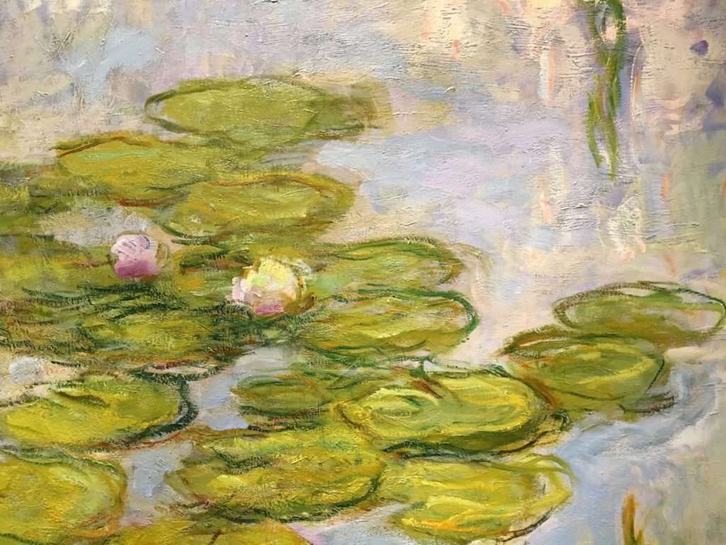
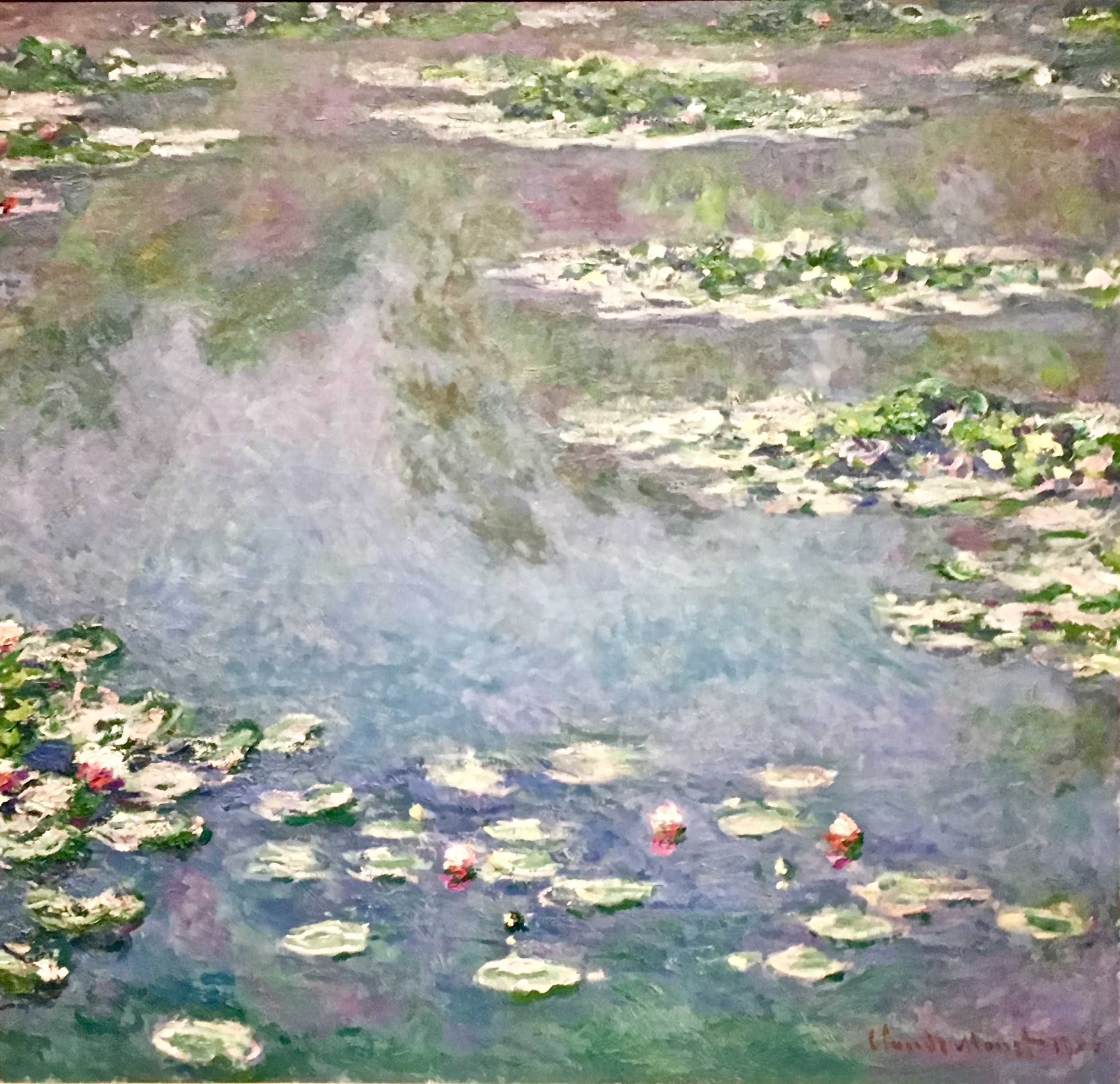
Look, I am no Monet! He’s the greatest painter ever, and I’m a mere amateur. Nonetheless, I aspire to learn from him—for example, in our paintings below, the color intensity is different, but the point of view is the same (click to enlarge):
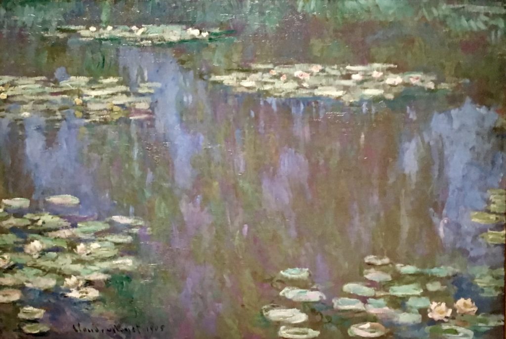
Water Lilies, 1907 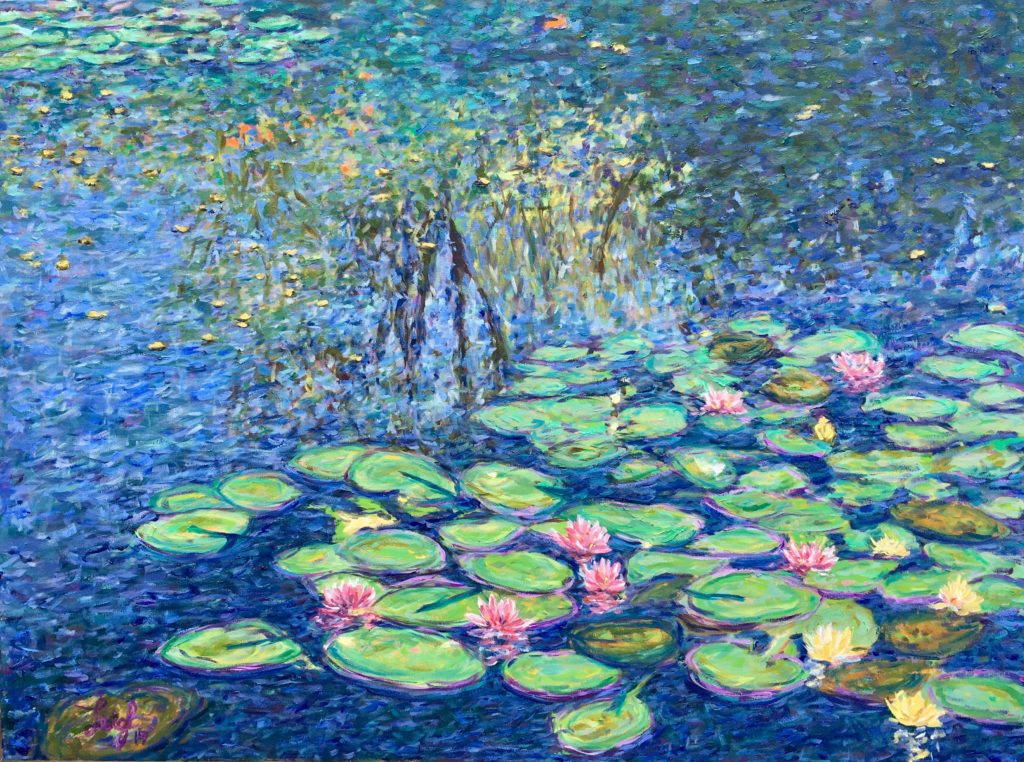
Water Lilies in Giverny by Leigh
SEE ALL 6 PROJECT PAINTINGS, DETAILS & MORE
How to Look at Paintings
The museum had easel paintings, which were purposefully created to sell, and études, unfinished paintings started by the lily pond as studies for his Grandes Décorations, the murals for France that are predominantly housed in the Musée de l’Orangerie in Paris. (More about this is an upcoming blog.)
Before going to San Francisco, I watched a lecture by Monet expert, Paul Hayes Tucker, on “Learning to Look,” which prompted me to ask: What draws me to some works more than others? What are the paintings’ highlights and spatial relationships? What colors were put down earlier and later? Although people typically spend about 3.5 seconds looking at a picture in a gallery,(1) I averaged almost 4.5 minutes per picture at the Monet exhibit.
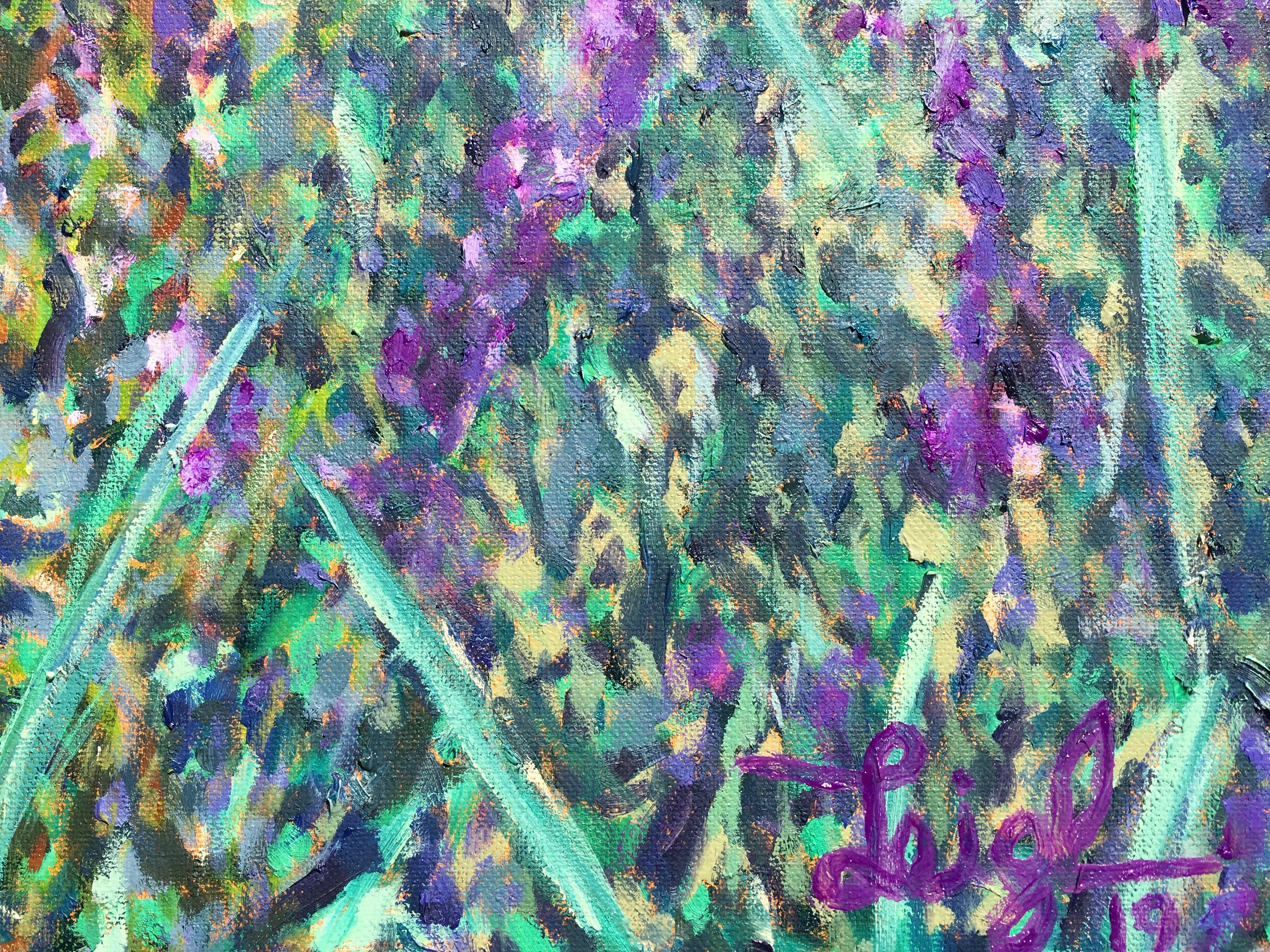
I observed the size and shape of his strokes, the use of contrasting hues and similar tonalities, and that the colors appear very different in person than in books or online. I especially liked seeing up close the many layers of paint, a topic I discussed in my last blog article. Keeping this in mind, I spent roughly 20 sessions with each of the six paintings in my “Monet-like” Project. Details below show the effects of layering and how painting wet-on-dry allows bits of colors to stand out distinctly without being muddy:
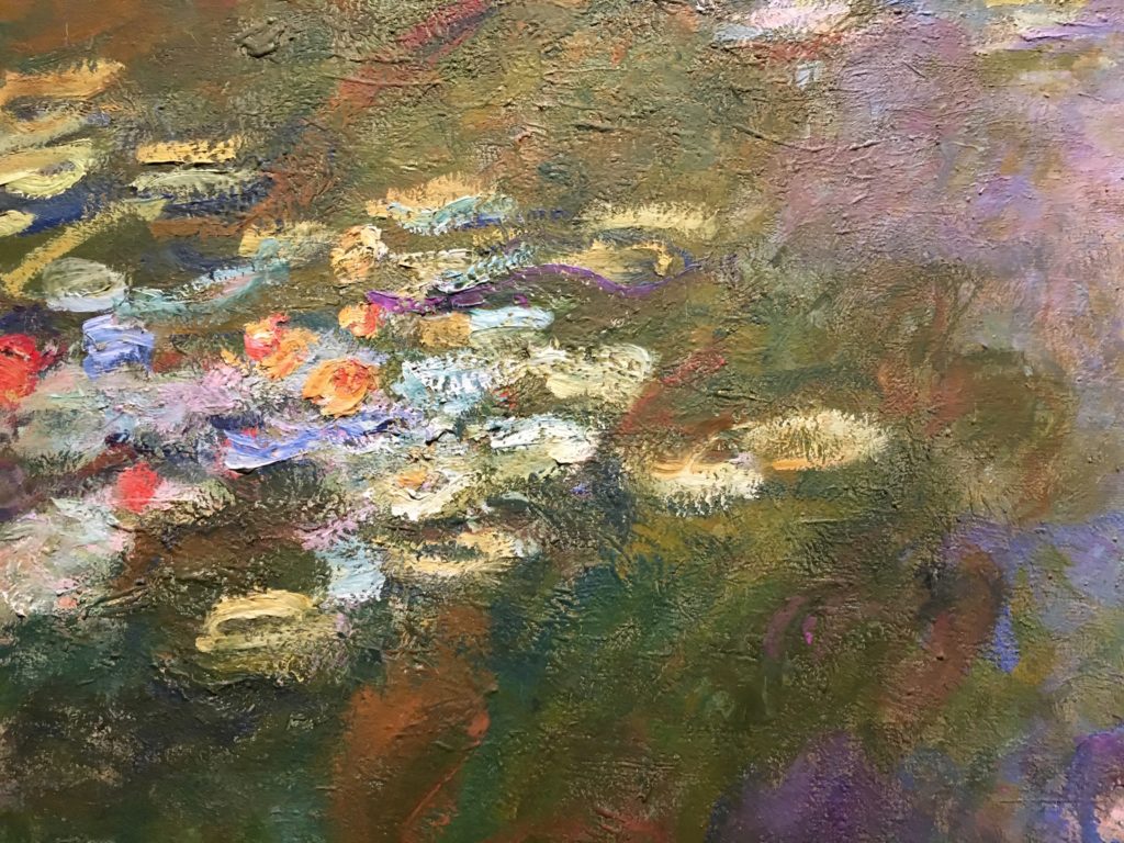
Water-Lily Pond, 1917-19 (detail) 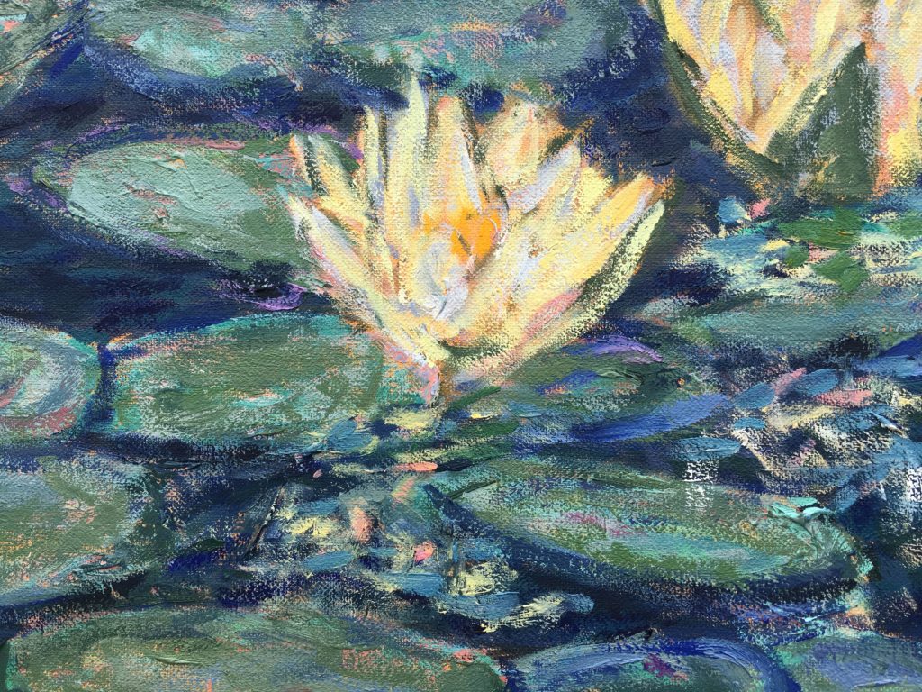
Water Lilies, 2019 (detail)
Frustrations and Successes
I’ve mentioned Monet’s self-criticism and dissatisfaction about his paintings in other blog posts, and I strongly experienced those kinds of feelings during this Project. His closest friend was Georges Clemenceau, prime minister of France during World War I, who knew the artist as a young man and sat bedside when Monet died. In Clemenceau’s verbose tribute written the following year, he describes the irritable painter as, “haunted by the fluidity of color…(with) painful moments of irrepressible doubt.”(2)
I get it! I felt for dear Claude but had my own problems. Foremost was my unfamiliarity with the combination of colors I chose to use for my six paintings. Having read various accounts about which paints Monet said he used, contradictory information based on invoices from his suppliers, and scientific studies, I settled on an assortment of colors (click below right) based on a paint analysis from an academic paper.(3) Unfortunately, the three colors I use most often were’t included in the Project (see caption):
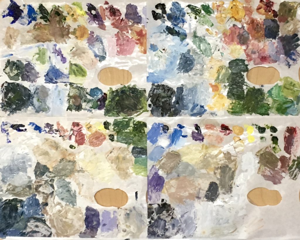

Left, Four typical palettes include three colors I use most often—Cerulean Blue, Pale Pink, and Naples Yellow. These were missing in the Project palette.
Right, Project palette: French Ultramarine Blue, Viridian, Emerald, Yellow Ochre, Cadmium Yellow, Zinc Yellow, Alizarin Crimson, Cobalt Violet
This was uncharted territory for me; I’d never had a palette with two greens, three yellows, and only one blue! Oftentimes during the first few weeks, I’d mix something on the palette that seemed okay, but looked quite different and wrong when I brushed it onto a canvas. I completed numerous sessions feeling exasperated and truly doubting that any of the six pieces would be salvageable.
Monet said that he painted what he saw, and I assume he had an idea of what a finished picture might look like before he started. Although for this Project I worked from photos, I only used them for composition—not color. Monet had severe vision problems when he got older; well, I felt like I was painting blind! I didn’t know what to expect. Here’s how the Project looked after the first few days and at the end:
Beginning stages 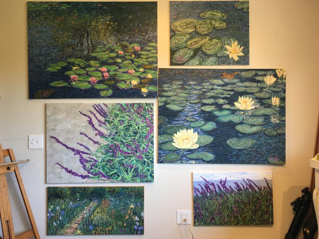
Final paintings
It didn’t matter how the individual paintings were coming along, by having them together on the wall, I was continually dissatisfied with at least one or two of them; and, thus, dismayed in the Project as a whole. (I moved them from the wall to an easel when I painted.)
Nonetheless, knowing I’d be painting over early layers and had no clear plan gave me more freedom than usual. I didn’t care how the canvas started out, because I knew the colors would be changed later. Routinely, I worked with only a few pigments at a time, and when I mixed one I especially liked, I’d dab it on various canvases.
But that led to another frustration. As the paintings developed, I obsessed over color. I’d fixate on a certain area of a particular picture and what mixture of colors would be the perfect tint. Thoughts of color combinations preoccupied me when I’d soak in the hot tub or wake up in the middle of the night, as well as in the studio.
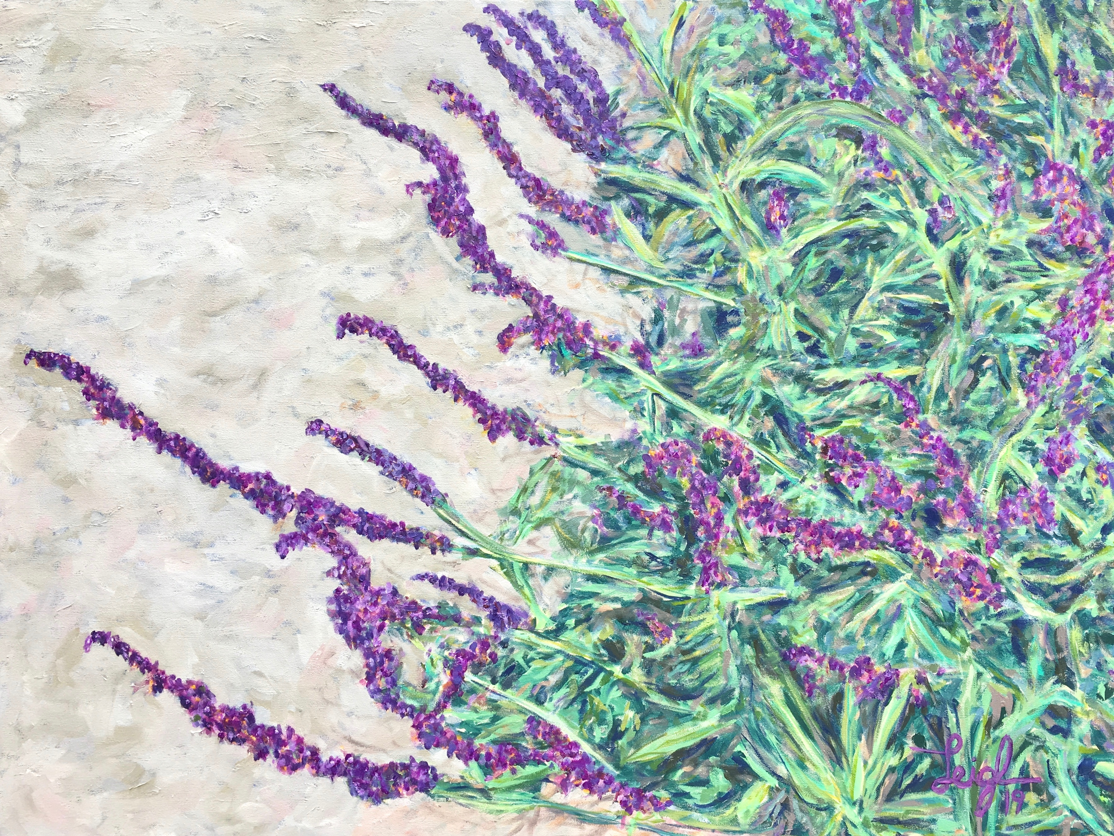
For example (below), the original photo of local Mexican Sage Brush showed bark in the background. Instead, I made it blue and added lily pads in the upper left corner. That didn’t work, so I chose another mixture for blue and painted over the previous layer and lily pads. Ugh! Still no good. As I fretted over that stumbling block, I looked for inspiration in the exhibit catalogue and considered two of Monet’s Wisteria paintings. In the book, their backgrounds were light blue and light purple, but that wasn’t how I remembered one of them. In my photos, I saw a more accurate representation of the actual warmer mix of beige, tan, and gray with other highlights (lower left), and it provided an excellent solution. The blue peeks through in the detail (lower right):
Wisteria, 1919-20 (detail) 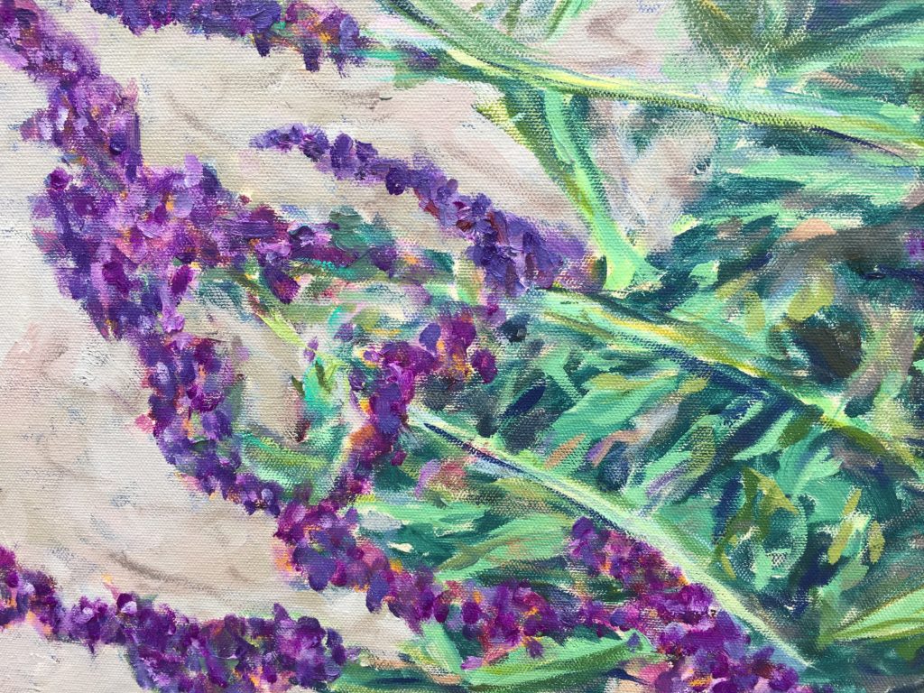
Detail
More Finished Paintings
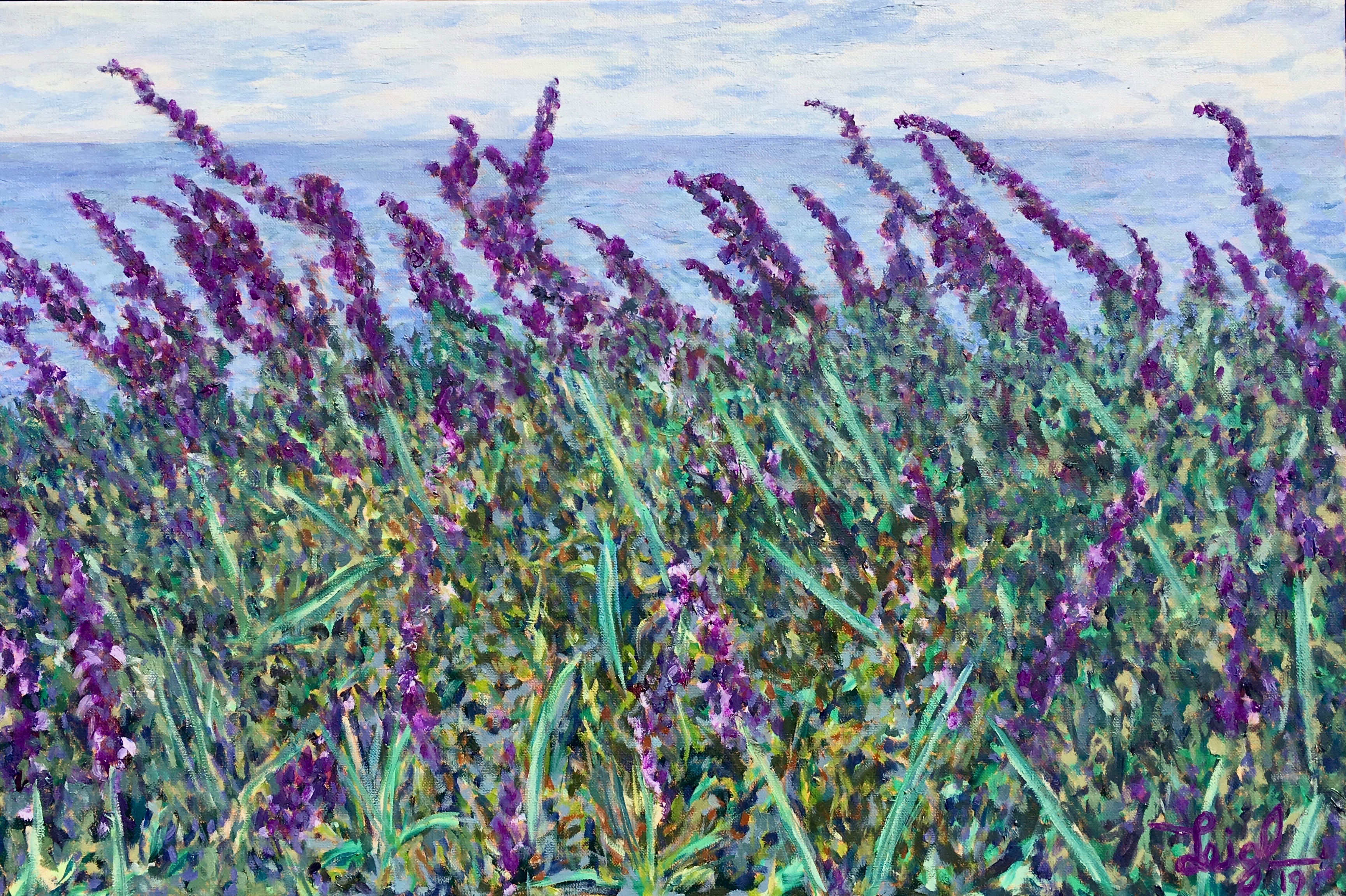
I painted the same kind of plant using a snapshot from Santa Monica. Even though Monet eliminated horizons in his late paintings, I decided to go ahead and include it. After all, these are my paintings, not his!
I also dug out a photo of Monet’s garden I took in 2012, and depicted its wide-variety of brilliant colors with applications wet-on-dry over 20 or so sessions. Check out the finished painting and a couple of details that more clearly show the effects of all those layers:
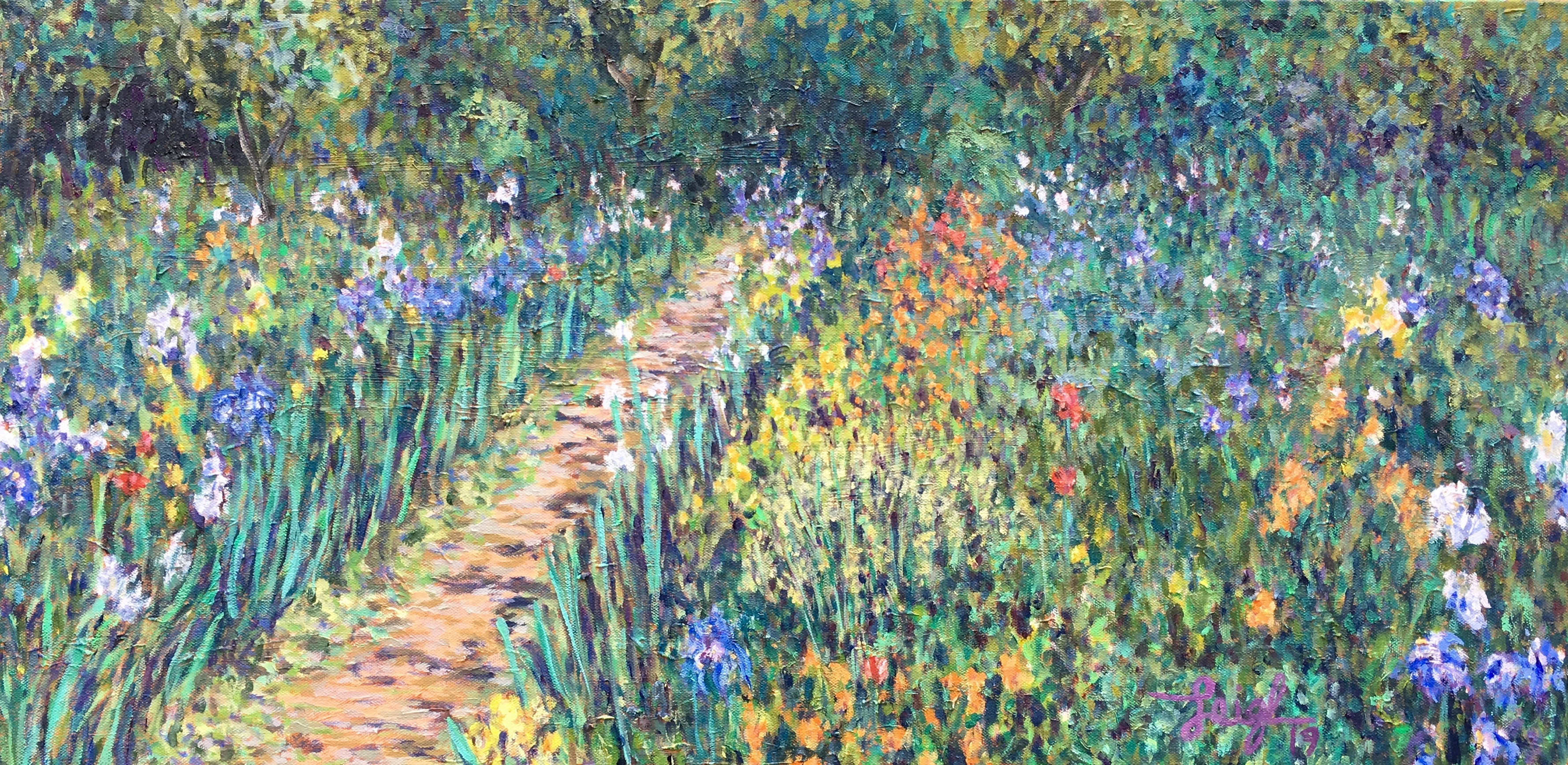
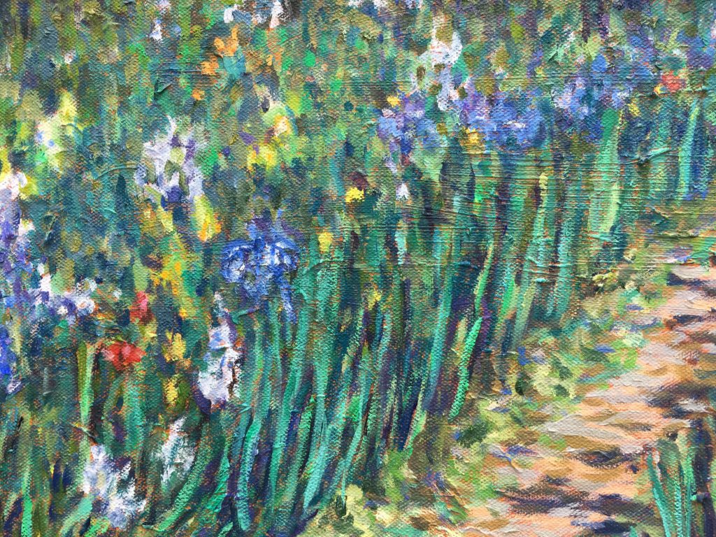
Detail 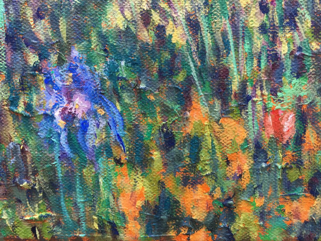
Detail
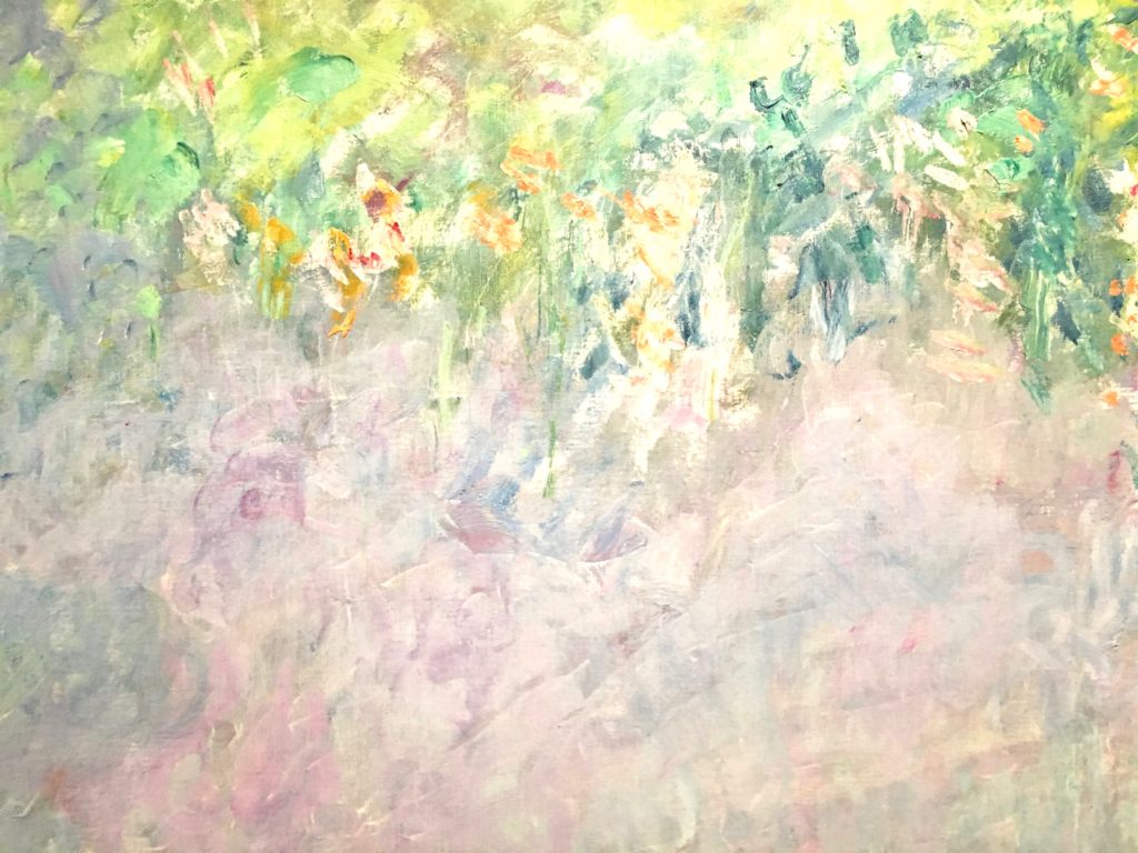
Based on a photo I shot outside the de Young museum while taking a break from the exhibition, this four-foot wide canvas (below) started with mauve lily pads, but the completed version has only traces of that color (details below left):


Early draft 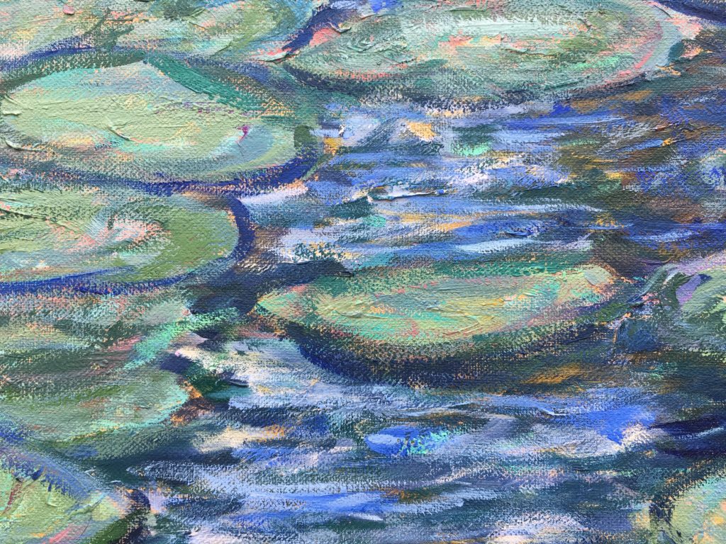
Detail
Slowly, the Project came together. Eventually, there were three water lily scenes and three gardens. The smallest canvas was the toughest, and I was on the verge of destroying it throughout most of the process. Totally exasperated, I amended the background with spare bits of colors from other pictures and let myself go with the lily pads. Ultimately, I think I captured a bit of Monet’s free flowing brush strokes in a more modernist style, which seemed fitting given that his late-career, decorative paintings influenced the evolution of Abstract Expressionism.(4)
Water Lilies, 1915-17 (Detail) 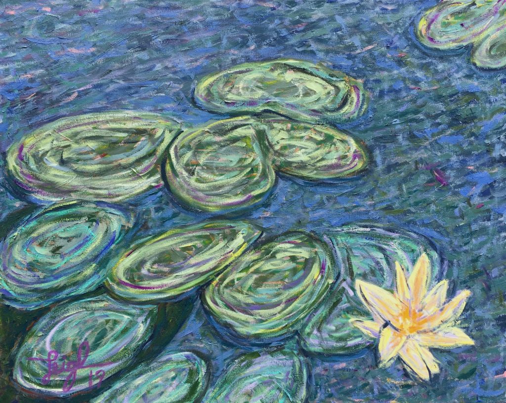
Yellow Lily, 2019
The Test of Time
In 1909, Monet’s opening act of pond paintings, “The Water Lilies, a Series of Water Landscapes,” premiered at the Durand-Ruel Galleries in Paris. There were some “offended” critics that failed to appreciate the upside-down reflections in water that replaced traditional horizons and sight lines, but most critics raved. They described it with phrases like, “magical evocation of the reflections,” “the beneficence of daydreams,” and “is this not a delightful poetic idea? Certainly!”(5) Spectators reveled in the uniqueness of being surrounded by water, and Clemenceau wished that the whole lot could be sold together, but the seed was planted for what would become Monet’s most dramatic undertaking, the Grandes Décorations—the subject of a future blog.
Monet’s most iconic and beautiful (in my opinion) paintings were in that 1909 exhibit. One of them ended up at the Art Institute of Chicago, where, as a child, I was introduced to Monet. Although I’d viewed many of the de Young paintings in person elsewhere, when I turned the corner and saw this particular picture, it was like seeing my first love, fully alive and unchanged since we met a lifetime ago.
Unlike the easel painting above, most of Monet’s études at the de Young were unsigned, because they were unfinished or unsold. However, when I considered the Project completed, I signed each of my six canvases with similar purple tints as a way to bond them as group.
SEE ALL 6 PROJECT PAINTINGS, DETAILS & MORE
Upcoming in “My Year of Monet”
After washing my hands of Monet’s palette, I’ve started a new series of water lilies on smaller canvases and with a wider selection of color choices. I’m continuing my reading and study, going back to the beginning of Monet’s career in preparation for a December trip to Denver for “Claude Monet: The Truth of Nature,” a large, career retrospective. Also, I’m looking into meeting one of the world’s foremost experts on Monet. Stay tuned…
References
(1) Tucker, Paul Hayes. “Learning to Look,” Cambridge Forum, Boston, MA. https://www.youtube.com/watch?v=JBuF3CFda8g
(2) Clemenceau, Georges, (1930 translation) Claude Monet; The Water Lilies, Doubleday, Garden City, NY, p. 184.
(3) Roy, Ashok, (2007), “Monet’s Palette in the Twentieth Century: Water-Lilies and Irises,” National Gallery Technical Bulletin, London, Volume 28.
(4) Mathieu, Marianne, (2019) “The Grandes Décorations: from Claude to Michel Monet 1914-1966,” in Monet: The Late Years, edited by George T. M. Shackelford, Yale University Press, p. 84.
(5) Cauvin, Emma, “The Late Monet and his Critics: Water Lilies, ‘Cunning Mirrors on Paradise,'” in Monet: The Late Years, edited by George T. M. Shackelford, Yale University Press, p. 64.
Thanks for sharing. I love them all, so beautiful!
Thanks for the update Leigh. Lovely to see how studious and intentional you are about your studies and work. I want to let you know the triptych we have has been only growing more lovely and graceful in our room the longer we enjoy it. Looking forward to more updates and hearing about your progress and deep study. Cheers!